Anomaly Detection Python – Easy to follow Examples
Anomaly detection identifies unusual items, data points, events, or observations significantly different from the norm. In Machine Learning and Data Science, you can use this process for cleaning up outliers from your datasets during the data preparation stage or build computer systems that react to unusual events. Examples of use-cases of anomaly detection might be analyzing network traffic spikes, application monitoring metrics deviations, or even security threads detection.
This article explains how to use Isolation Forests and Local Outlier Factor algorithms for anomaly detection (Python) in your datasets.
Table of contents
The performance of any Machine Learning algorithm is highly dependent on the accuracy of provided dataset. In real-world scenarios, we usually deal with raw data to be analyzed and preprocessed before running Machine Learning tasks. Preparing a dataset for training is called Exploratory Data Analysis (EDA), and anomaly detection is one of the steps of this process.
What is an anomaly?
An anomaly is an unusual item, data point, event, or observation significantly different from the norm. Anomaly detection algorithms help to automatically identify data points in the dataset that do not match other data points. In Data Science and Machine Learning, the anomaly data point in the dataset is also called the “outlier,” and these terms are used interchangeably.
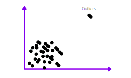
Here’s how anomalies or outliers from the dataset usually look in the charts:
There are several types of anomalies:
- Point anomalies are objects that lay far away from the dataset’s mean or median distribution. An example of a point anomaly might be a single transaction of a huge amount of money from a credit card.
- Contextual anomaly is a context-specific anomaly that commonly occurs in time-series datasets. For example, high traffic volume to a website might be a common thing during any weekday, but not during a weekend. So, unexpected traffic spikes during the weekend might represent a contextual anomaly.
- A collective anomaly describes a group of related anomaly objects, The individual data instance in a collective anomaly may not be an anomaly by itself, but multiple occurrences of such data points together might be an anomaly. For example, a single slow network connection to the website might not be an issue in general, but thousands of such connections might represent a DDoS attack.
Visual anomalies detection
The quickest way to find anomalies in the dataset is to visualize its data points. For example, outliers are easily identifiable by visualizing data series using box plots, scatter plots, or line charts.
Box plot
The box plot is a standardized way of displaying data distribution based on five metrics: minimum, first quartile (Q1), median, third quartile (Q3), and maximum:
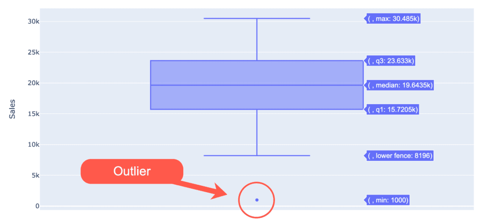
The box plot doesn’t show the data distribution and the histogram. However, it’s still handy for indicating whether a distribution contains potential unusual data points (outliers) in the dataset.
The box plot has the following characteristics:
- The bottom and top sides of the box are the lower and upper quartiles. The box covers the interquartile interval containing 50% of the data.
- The median is the vertical line that splits the box into two parts.
- The whiskers are the two lines outside the box that goes from the minimum to the lower quartile and then from the upper quartile to the maximum.
- Any data point that lies outside the whiskers is considered an outlier.
- A variation of the box and whisker plot restricts the length of the whiskers to a maximum of 1.5 times the interquartile range. Data points outside this interval are represented as points on the graph and considered potential outliers.
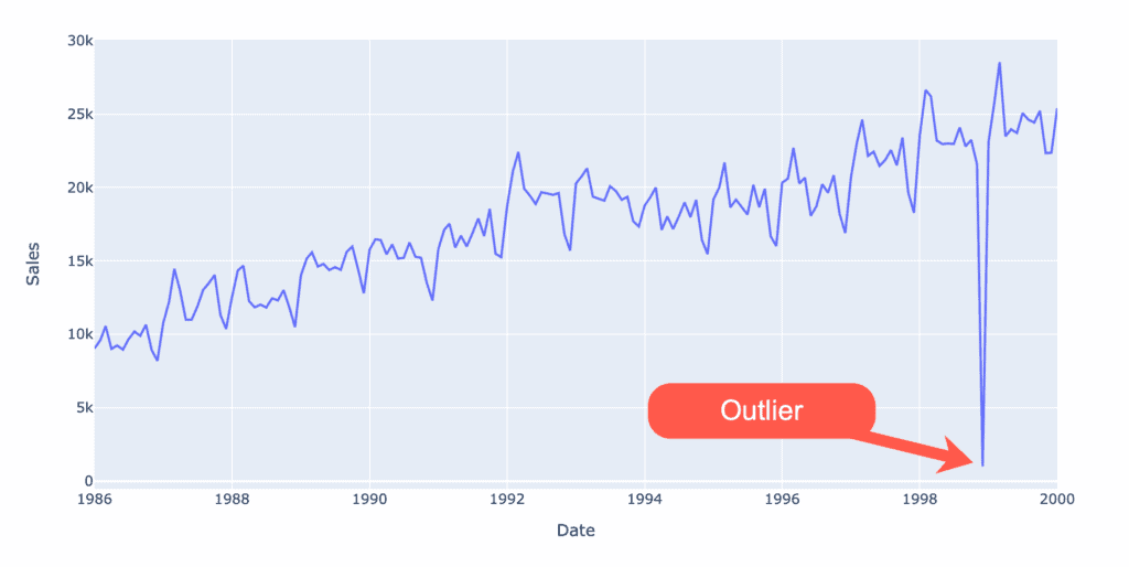
Line chart
The line chart is ideal for visualizing a series of data points. If the data series contains any anomalies, they can be easily visually identifiable.
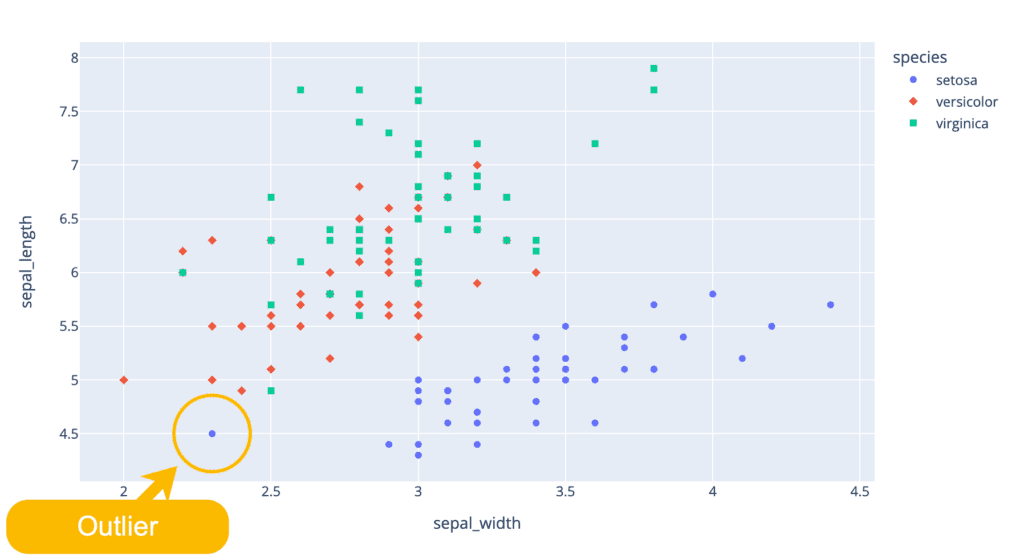
Scatter plot
A scatter plot uses dots to represent values for two different numeric variables. The position of each dot on the horizontal and vertical axis indicates values for an individual data point. Scatter plots are used to observe relationships between variables.
charts.io – What is a scatter plot
If the dataset contains anomalies, you can see them on that chart. Here’s a visualization of the famous Iris dataset where we can easily see at least one outlier:
Detecting and fixing anomalies in datasets
In this section of the article, we’ll show how anomalies (or outliers) can significantly affect the outcomes of any Machine Learning model by analyzing a simple dataset.
Let’s install several required Python modules by running the following commands in the cell of the Jupyter Notebook:
%pip install sklearn
%pip install pandas
%pip install numpy
%pip install matplotlib
%pip install plotly
%pip install seaborn
%pip install sktime
%pip install statsmodels
Exploring dataset
The first step is to import the dataset and familiarize ourselves with the data type. We will analyze a simple dataset containing catfish sales from 1986 to 2001. You can download the dataset from this link.
# Import pandas
import pandas as pd

# Read data
dataset = pd.read_csv('catfish_sales_1986_2001.csv', parse_dates=[0])
# Printing head of the DataFrame
dataset.head()
Output:
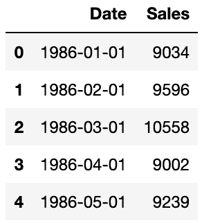
The output shows that our data has two columns containing the date and number of sales each month. Now let us visualize the dataset to see sales information more clearly:
import plotly.express as px
# Limiting DataFrame to specific date
mask = (dataset['Date'] <= '2000-01-01')
dataset = dataset.loc[mask]
# Plotting a part of DataFrame
fig = px.line(dataset, x='Date', y="Sales", title='Catfish sales 1986-2000')
fig.show()
Output:
The output looks good, and we don’t have any anomalies in the dataset. Let’s double-check it using the box plot:
import plotly.express as px
fig = px.box(dataset, y="Sales", title='Catfish sales 1986-2000')
fig.show()
The box plot chart does not show any outliers.
Re-indexing dataset
As you’ve seen above, the DataFrame’s index is an integer type. It would be helpful to re-index the entire DataFrame using the information from the Date column as a new index:
# convert the column (it's a string) to datetime type
datetime_series = pd.to_datetime(dataset['Date'])
# create datetime index passing the datetime series
datetime_index = pd.DatetimeIndex(datetime_series.values)
# datetime_index
period_index = pd.PeriodIndex(datetime_index, freq='M')
# period_index
dataset = dataset.set_index(period_index)
# we don't need the column anymore
dataset.drop('Date',axis=1,inplace=True)
dataset.head()
Output:
Price prediction (dataset without anomalies)
Now, let’s predict the 1999 prices based on existing historical time-series data from 1986 year.
First, let’s split our dataset:
import plotly.graph_objects as go
from sktime.forecasting.model_selection import temporal_train_test_split
# Splitting dataset (test dataset size is last 12 periods/months)
y_train, y_test = temporal_train_test_split(dataset, test_size=12)
# Visualizing train/test dataset
fig = go.Figure()
fig.add_trace(go.Scatter(
    name="Train DataSet", x=y_train.index.astype(str), y=y_train['Sales']
))
fig.add_trace(go.Scatter(
    name="Test DataSet", x=y_test.index.astype(str), y=y_test['Sales']
))
fig.update_layout(
    title="Splitted dataset"
)
fig.show()
Output:
We’ll use the SARIMA algorithm to model and estimate prices for the catfish market based on our historical dataset for demo purposes.
from statsmodels.tsa.statespace.sarimax import SARIMAX
model = SARIMAX(y_train['Sales'], order=(1, 1, 1), seasonal_order=(1,0,1,12))
model_fit = model.fit()
y_pred = model_fit.predict(start=len(y_train), end=len(y_train)+11, exog=None, dynamic=True)
Let’s visualize prediction results:
fig = go.Figure()
fig.add_trace(go.Scatter(
    name="Train DataSet", x=y_train.index.astype(str), y=y_train['Sales']
))
fig.add_trace(go.Scatter(
    name="Test DataSet", x=y_test.index.astype(str), y=y_test['Sales']
))
fig.add_trace(go.Scatter(
    name="Prediction", x=y_pred.index.astype(str), y=y_pred.values
))
fig.update_layout(
    title="Predicted vs actual values"
)
fig.show()
Output:
As you can see, the SARIMA algorithm highly predicted future prices.
Here are Mean Absolute Error (MAE) and Mean Absolute Percentage Error (MAPE) values:
from sklearn.metrics import mean_absolute_error, mean_absolute_percentage_error
mae = mean_absolute_error(list(y_test['Sales']), list(y_pred))
mape = mean_absolute_percentage_error(list(y_test['Sales']), list(y_pred))
print('MAE: %.3f' % mae)
print('MAPE: %.3f' % mape)
Output:
MAE: 930.138MAPE: 0.036
Price prediction (dataset with anomalies)
Let’s break down the dataset and introduce an anomaly point to see the influence of anomalies on the same prediction algorithm:
from datetime import datetime
# Cloning good dataset
broken_dataset = dataset.copy()
# Breaking clonned dataset with random anomaly
broken_dataset.loc[datetime(1998, 12, 1),['Sales']] = 1000
Here’s the visualization of the broken dataset:
import plotly.express as px
# Plotting DataFrame
fig = px.line(
    broken_dataset,
    x=broken_dataset.index.astype(str),
    y=broken_dataset['Sales']
)
fig.update_layout(
    yaxis_title='Sales',
    xaxis_title='Date',
    title='Catfish sales 1986-2000 (broken)'
)
fig.show()
Output:
Let’s use the box plot to see the outlier:
import plotly.express as px
fig = px.box(broken_dataset, y="Sales")
fig.show()
Output:
The box plot shows one anomaly point under a lower whisker.
We can run the same algorithm to visualize the difference in predictions.
Let’s split the dataset:
import plotly.graph_objects as go
from sktime.forecasting.model_selection import temporal_train_test_split
# Splitting dataset (test dataset size is last 12 periods/months)
y_train, y_test = temporal_train_test_split(broken_dataset, test_size=12)
# Visualizing train/test dataset
fig = go.Figure()
fig.add_trace(go.Scatter(
    name="Train DataSet", x=y_train.index.astype(str), y=y_train['Sales']
))
fig.add_trace(go.Scatter(
    name="Test DataSet", x=y_test.index.astype(str), y=y_test['Sales']
))
fig.update_layout(
    title="Splitted dataset"
)
fig.show()
Now, let’s run the SARIMA algorithm:
from statsmodels.tsa.statespace.sarimax import SARIMAX
model = SARIMAX(y_train['Sales'], order=(1, 1, 1), seasonal_order=(1,0,1,12))
model_fit = model.fit()
y_pred = model_fit.predict(start=len(y_train), end=len(y_train)+11, exog=None, dynamic=True)
And visualize prediction results:
import plotly.graph_objects as go
fig = go.Figure()
fig.add_trace(go.Scatter(
    name="Train DataSet", x=y_train.index.astype(str), y=y_train['Sales']
))
fig.add_trace(go.Scatter(
    name="Test DataSet", x=y_test.index.astype(str), y=y_test['Sales']
))
fig.add_trace(go.Scatter(
    name="Prediction", x=y_pred.index.astype(str), y=y_pred.values
))
fig.update_layout(
    yaxis_title='Sales',
    xaxis_title='Date',
    title='Catfish sales 1986-2000 incorrect predictions'
)
fig.show()
As you can see, predictions follow the pattern but are not even close to the actual values.
from sklearn.metrics import mean_absolute_error, mean_absolute_percentage_error
mae = mean_absolute_error(list(y_test['Sales']), list(y_pred))
mape = mean_absolute_percentage_error(list(y_test['Sales']), list(y_pred))
print('MAE: %.3f' % mae)
print('MAPE: %.3f' % mape)
Output:
MAE: 8401.406MAPE: 0.345
Anomaly detection Python examples
It is challenging to find data anomalies, especially when dealing with large datasets. Fortunately, the sklearn Python module has many built-in algorithms to help us solve this problem, such as Isolation Forests, DBSCAN, Local Outlier Factors (LOF), and many others.
Isolation Forest
Isolation Forest is an unsupervised learning algorithm that identifies anomalies by isolating outliers in the data based on the Decision Tree Algorithm. It separates the outliers by randomly selecting a feature from the given set of features and then selecting a split value between the max and min values. This random partitioning of features will produce shorter paths in trees for the anomalous data points, thus distinguishing them from the rest of the data.
Let’s use the sklearn Isolation Forest implementation on the same broken dataset to implement anomaly detection with Python.
# importing the isloation forest
from sklearn.ensemble import IsolationForest
# copying dataset
isf_dataset = broken_dataset.copy()
# initializing Isolation Forest
clf = IsolationForest(max_samples='auto', contamination=0.01)
# training
clf.fit(isf_dataset)
# finding anomalies
isf_dataset['Anomaly'] = clf.predict(isf_dataset)
# saving anomalies to a separate dataset for visualization purposes
anomalies = isf_dataset.query('Anomaly == -1')
Let’s visualize our findings:
import plotly.graph_objects as go
b1 = go.Scatter(x=isf_dataset.index.astype(str),
                y=isf_dataset['Sales'],
                name="Dataset",
                mode='markers'
               )
b2 = go.Scatter(x=anomalies.index.astype(str),
                y=anomalies['Sales'],
                name="Anomalies",
                mode='markers',
                marker=dict(color='red', size=6,
                            line=dict(color='red', width=1))
               )
layout = go.Layout(
    title="Isolation Forest results",
    yaxis_title='Sales',
    xaxis_title='Date',
    hovermode='closest'
)
data = [b1, b2]
fig = go.Figure(data=data, layout=layout)
fig.show()
Output:
As you can see, the Isolation Forests algorithm detected two anomalies, including the one we introduced ourselves.
Local Outlier Factor (LOF)
The Local Outlier Factor (LOF) algorithm helps identify outliers based on the density of data points for every local data point in the dataset. The algorithm performs well when the data density is not the same throughout the dataset.
Let’s apply the Local Outlier Factor algorithm to our dataset and find anomalies.
# Importing then local outlier factor
from sklearn.neighbors import LocalOutlierFactor
# copying dataset
lof_dataset = broken_dataset.copy()
# initializing the Local Outlier Factor algorithm
clf = LocalOutlierFactor(n_neighbors=10)
# training and finding anomalies
lof_dataset['Anomaly'] = clf.fit_predict(lof_dataset)
# saving anomalies to another dataset for visualization purposes
anomalies = isf_dataset.query('Anomaly == -1')
Let’s visualize our findings:
As in the case of the Isolation Forests algorithm, the Local Outlier Factor algorithm detected two anomalies, including the one we introduced ourselves.
FAQ
Which algorithm is best for anomaly detection?
What are the three 3 basic approaches to anomaly detection?
Can we use KNN for anomaly detection?
Can PCA be used for anomaly detection?
Summary
Anomaly detection is locating unusual items, data points, occurrences, or observations that make suspicions because they differ from the rest of the data points or observations. In this article, we’ve covered anomalies (outliers) and their effect on the prediction algorithms.
