Implementing Principal Component Analysis (PCA) using Python
Dimensionality reduction transfers data from a high-dimensional space into a low-dimensional space so that the low-dimensional representation of data retains only significant aspects of the original data. One of the dimensionality reduction techniques is the Principal Component Analysis (PCA) algorithm that converts a set of observations of possibly correlated variables into a set of linearly uncorrelated variables. In this article, we will discuss how you can use the Principal Component Analysis to reduce data dimensions by using Python programming language. We will be using the AWS SageMaker and Jupyter Notebook for implementation and visualization purposes.
Table of contents
The processing of high-dimensional datasets might be a complex problem as we need higher compute resources, or it is harder to control the Machine Learning model over-fitting, etc. To avoid such issues, you can reduce the dimensionality of the dataset.
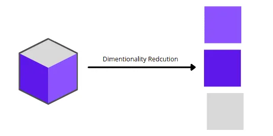
Here’s a visualization of transforming a 3D dataset into three 2D datasets:
Overview of Principal Component Analysis (PCA)
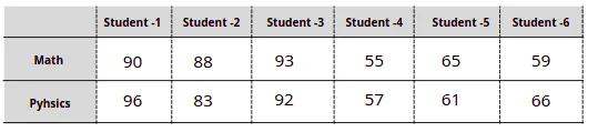
Let’s take a look at how the Principal Component Analysis algorithm works by examining a simple dataset that represents students’ tests scores in Math and Physics:
The easiest way to get scores distribution for every subject is to visualize each subject’s scores in one dimension:

The above visualization shows that the scores of students 1, 2, and 3 are way better in Maths than students 4, 5, and 6.
Now, let’s visualize the dataset in a two-dimensional (2D) space:
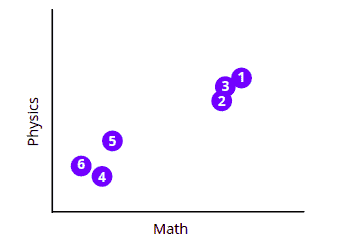
The above chart shows that all students can be splitter into two clusters or groups based on their tests’ scores.
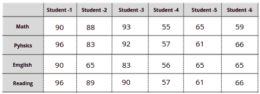
We know how to visualize data up to three dimensions, but the problem arises if the dataset is bigger, for example, when we have four and more subjects in the same dataset:
In such scenarios, we can use the Principal Component Analysis (PCA) to reduce the data dimensions, analyze, and visualize the data using 2D or 3D charts.
Principal Component Analysis (PCA) algorithm
To understand how the PCA algorithm works, let’s take the same simple dataset and review the algorithm execution step-by-step.
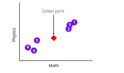
First, the Principal Component Analysis algorithm will find the average measurements of the data points and will find their center point. In our case, it will find the average measurements of the Math and Physics subject and will locate the center point.
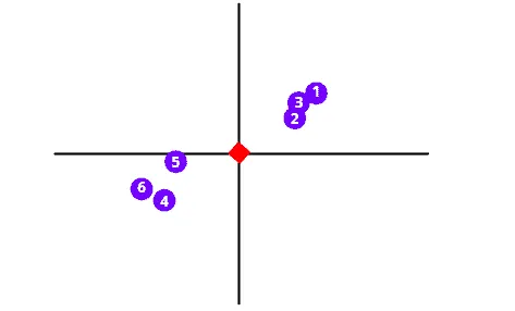
The next step is to shift the data in such a way as to move the center point to the graph’s origin. Notice that the shifting does not affect the positioning of data points relative to each other.
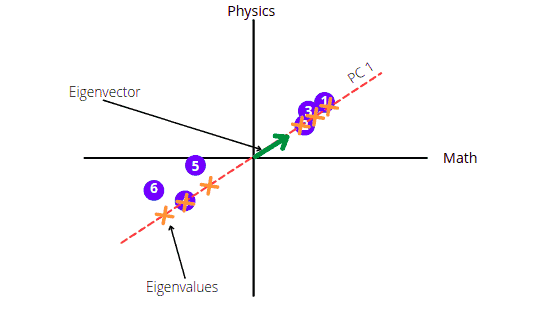
As soon as data points are centered on the origin, the PCA algorithm will start drawing a random line through the origin that best fits the dataset. To understand how the PCA calculates the best fit line, you can read the Principal Component Analysis(PCA) | Dimensionality Reduction |Theoritcal and Mathematical Intuition | Machine Learning Part-2 article.
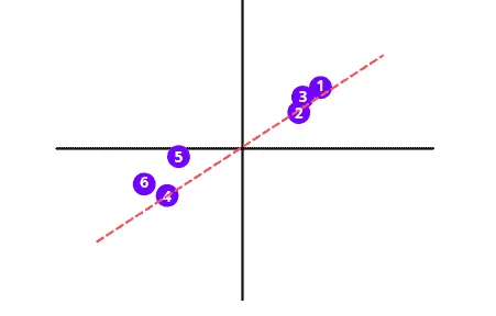
This best fit line is called Principal Component (“PC 1” in the illustration below). The unit vector along the PC 1 starting from the origin is Eigenvector. And the distances corresponding to the data points on the PC 1 are called Eigenvalues.
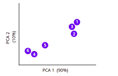
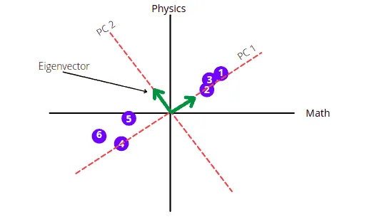
The PC 2 will be the perpendicular line to PC 1 going through the origin.
The graph shows that the score is mainly spread along the Math axis. This means Math subject is more important when describing how the score is spread out.
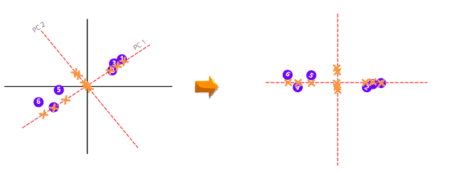
To draw the final PCA, we need to rotate the PC1 and PC2 so that PC1 comes in a horizontal position.
The PCA will then calculate the variation among all Principal Components and arrange them in ascending order. The PCA with a low percentage of variance is dropped to get less dimensional data. For example, when we have the following 3-dimensional data with the given PC variance percentages. The PCA will drop the PC with the lowest variance percentage, and we will have a 2-dimensional graph.
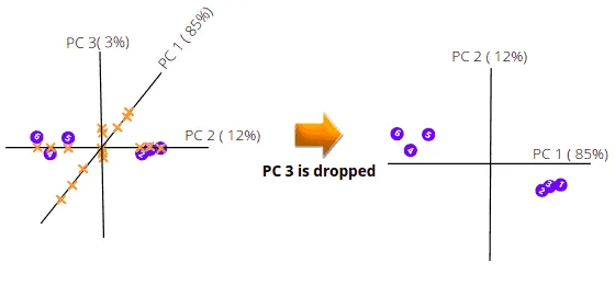
The above illustration shows how the PCA helps us visualize multi-dimensional data in 2-dimensional space.
Visualizing PCA using Python on AWS Jupyter Notebook
Let us now implement the PCA algorithm on a multi-dimensional dataset to get 2-D and 3-D visualization. Before going to the implementation, let us install all the required modules.
%pip install sklearn
%pip install pandas
%pip install numpy
%pip install matplotlib
%pip install plotly
Exploring dataset
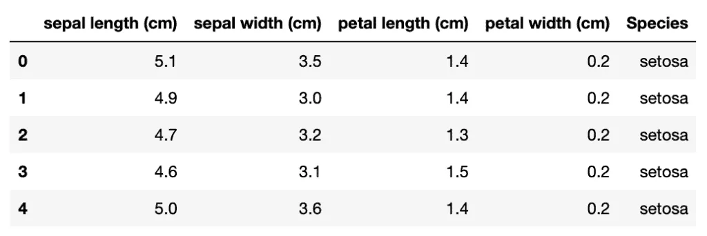
This section will use the iris dataset, a Python built-in dataset. You can either import the dataset from datasets module in Python. It consists of 3 different irises’ (Setosa, Versicolour, and Virginica) petal and sepal lengths.
Let us import the dataset and print the heading.
# importing required modules
import pandas as pd
from sklearn import datasets
# importing the dataset
iris = datasets.load_iris()
dataset = pd.DataFrame(data= np.c_[iris['data'], iris['target']],
                     columns= iris['feature_names'] + ['target'])
# heading of the dataset
dataset.head()
Output:
Let’s plot the violin plot to understand the distribution of each of the attributes. Violin plots are similar to box plots, but they also show the probability density of the data for different values:
#importing the required modules
from plotly.subplots import make_subplots
import plotly.graph_objects as go
# creating subplot for the four attributes
fig = make_subplots(rows=2, cols=2,
                    subplot_titles=("sepal length (cm)",
                                    "petal length (cm)",
                                    "sepal width (cm)",
                                    "petal width (cm)")
                   )
# creating volin plot for sepal length
fig.append_trace(go.Violin(
    x=dataset['sepal length (cm)'],
    name='sepal length (cm)'
), row=1, col=1)

# creating volin plot for the sepal width
fig.append_trace(go.Violin(
    x=dataset['sepal width (cm)'],
    name='sepal width (cm)'
), row=2, col=1)

# creating  volin plot for the petal length
fig.append_trace(go.Violin(
    x=dataset['petal length (cm)'],
    name='petal length (cm)'
), row=1, col=2)

# creating volin plot for the petal width
fig.append_trace(go.Violin(
    x=dataset['petal width (cm)'],
    name='petal width (cm)'
), row=2, col=2)

# showing the graph
fig.update_layout(height=600, width=900, title_text="Violin Subplots", template="simple_white")
fig.show()
Output:
Visualizing dataset without PCA
Our data contains four attributes, so it is impossible to plot them on one graph, but we can take every unique pair of characteristics and visualize them on a scattered plot.
# importing the required module
import plotly.express as px
# features of the data
features = ["SepalLengthCm", "SepalWidthCm", "PetalLengthCm", "PetalWidthCm"]
# ploting scattere graph fo each attribute
fig = px.scatter_matrix(
    dataset,
    dimensions=features,
    color="Species"
)
# ploting the graph
fig.update_traces(diagonal_visible=False)
fig.show()
Output:
The above-scattered plot shows the relationship of each attribute with each other.
Implementing PCA using Python
Now let’s apply the PCA algorithm to the dataset to return the Principal Components with different percentages of variance value. And depending on the variance percentages, we can drop the PC with the lowest value.
# importing required modules
from sklearn.decomposition import PCA
# initializing the PCA
pca = PCA()
# training the model on the dataset
components = pca.fit_transform(dataset[features])
# labeling the plot
labels = {
    str(i): f"PC {i+1} ({var:.1f}%)"
    for i, var in enumerate(pca.explained_variance_ratio_ * 100)
}
# Ploting the scattered graph
fig = px.scatter_matrix(
    components,
    labels=labels,
    dimensions=range(4),
    color=dataset["Species"]
)
# ploting graph
fig.update_traces(diagonal_visible=False)
fig.show()
Output:
The chart above shows that the Principal Components “PC1” and “PC2” have the highest variance values. That means we can drop the other two Principal Components.
3D visualization of the dataset using PCA
We can drop the fourth PC with a low variance value and then visualize the data with the remaining three PCs to get a 3D graph (plotted below):
# creating dataset of only attributes
features = [
    "sepal length (cm)",
    "petal length (cm)",
    "sepal width (cm)",
    "petal width (cm)"
]
X = dataset[features]
# PCA with three PC
pca = PCA(n_components=3)
# Training on dataset
components = pca.fit_transform(X)
total_var = pca.explained_variance_ratio_.sum() * 100
# creating 3-d graph
fig = px.scatter_3d(
    components, x=0, y=1, z=2, color=dataset['Species'],
    title=f'Total Explained Variance: {total_var:.2f}%',
    labels={'0': 'PC 1', '1': 'PC 2', '2': 'PC 3'}
)
fig.show()
Output:
The output shows how three flowers are related to each other based on the given four attributes in a 3D plot.
2D visualization of the dataset using PCA
We can drop one more PC to visualize flowers’ relationships using the given four attributes in a 2D space:
# PCA with 2 PC
pca = PCA(n_components=2)
# training the model
components = pca.fit_transform(X)
# Creating the graph
fig = px.scatter(components, x=0, y=1, color=dataset['Species'])
fig.show()
Output:
Compression of Image using PCA
Usually, images have a lot of pixels to retain their clarity, but that significantly increases its size and slows down the performance of the Machine Learning algorithms when it has to process multiple images. To overcome this situation, we can use any dimensionality reduction methods. Here we will use one picture and compress the size using PCA. You can download the image from this link.
You need to install the cv2 library on your system because we will use it in the image compression process.
%pip install opencv-python-headlessLet’s now import the required libraries and the image that will compress.
# importing the required modules
import cv2
import matplotlib.pyplot as plt
# importing the image
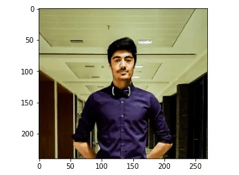
img = cv2.cvtColor(cv2.imread('Image.png'), cv2.COLOR_BGR2RGB)
# showing the image
plt.imshow(img)
plt.show()Output:
Let us check the shape of the image.
# printing the shape of the image
print(img.shape)
Output:

The first two values show the size of the matrix, while the third value(3) shows that the image is RGB.
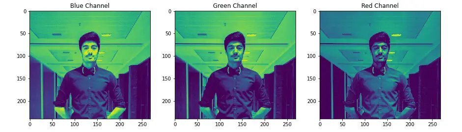
Splitting the Image
As known, it is an RGB image, where three different matrices (images) have been merged to get the colorful image again.
Let us separate these three images:
#Splitting into thre
blue,green,red = cv2.split(img)

# Plotting the images
fig = plt.figure(figsize = (15, 7.2))
# blue colored image
fig.add_subplot(131)
plt.title("Blue Channel")
plt.imshow(blue)
# Green colored image
fig.add_subplot(132)
plt.title("Green Channel")
plt.imshow(green)
# Red colored image
fig.add_subplot(133)
plt.title("Red Channel")
plt.imshow(red)
plt.show()
Output:
We can now access each matrix that represents the three images separately. The shape of these images will be equal to the original image.
# printing the shape
print(blue.shape)
print(red.shape)
print(green.shape)
Output:
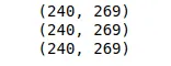
Notice that the shape of the splitter matrix is the same as the original matrix.
Reducing image size
Let us now reduce the size of the image matrix using PCA. We will specify the number of Principal Components to be 50 (out of 269).
# scalling the matrix values in between 0, 1
df_blue = blue/255
df_green = green/255
df_red = red/255
# PCA with 50 components for blue matrix
pca_b = PCA(n_components=50)
pca_b.fit(df_blue)
trans_pca_b = pca_b.transform(df_blue)
# PCA with 50 components for green one
pca_g = PCA(n_components=50)
pca_g.fit(df_green)
trans_pca_g = pca_g.transform(df_green)
# PCA with 50 component for the red one
pca_r = PCA(n_components=50)
pca_r.fit(df_red)
trans_pca_r = pca_r.transform(df_red)
# printing the shapes of the matrix
print(trans_pca_b.shape)
print(trans_pca_r.shape)
print(trans_pca_g.shape)
Output:

We can also see the variance percentage in the reduced matrices.
# printing the varinace percentage
print(f"Blue Matrix : {sum(pca_b.explained_variance_ratio_)}")
print(f"Green Matrix: {sum(pca_g.explained_variance_ratio_)}")
print(f"Red Matrix  : {sum(pca_r.explained_variance_ratio_)}")
Output:

The output shows that by using only 50 components, we can keep around 99% of the variance in the data.
Visualizing the compressed image
After completing PCA dimensionality reduction, we can visualize the image again. To do that, we have to do the inverse transformation of data points for every RGB layer and then merge them into one.
# Reversing the transfrom
blue_arr = pca_b.inverse_transform(trans_pca_b)
green_arr = pca_g.inverse_transform(trans_pca_g)
red_arr = pca_r.inverse_transform(trans_pca_r)
# merging the reduced separated matrices
img_reduced= (cv2.merge((blue_arr, green_arr, red_arr)))
Let’s plot the original and reduced images to see the differences:
# size of plot
fig = plt.figure(figsize = (10, 7.2))
# Origional image
fig.add_subplot(121)
plt.title("Original Image")
plt.imshow(img)
# Reduced image
fig.add_subplot(122)
plt.title("Reduced Image")
plt.imshow(img_reduced)
plt.show()
Output:
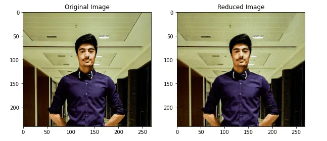
As you can see, there’s almost no difference between the images.
Summary
The Principal Component Analysis algorithm is an unsupervised statistical technique used to reduce the dimensions of the dataset and identify relationships between its variables. This article covered Principal Component Analysis algorithm implementation for dimensionality reduction and image compression using Python.
