Introduction to Matplotlib
People can understand things better when they see them visually. In Machine Learning, visualization helps us analyze datasets and get insights from them. One of Python’s data visualization modules is Matplotlib, a comprehensive library for creating static, animated, and interactive visualizations. It is a numerical mathematics extension NumPy designed to work with the broader SciPy stack and allows you to create various plots like line, bar, scatter, histogram, etc. In this article, we will cover various types of graphs that you can use to visualize the data using Matplotlib.
Table of contents
Installation of Matplotlib
Before using the Matplotlib module, ensure you have installed the updated version.
The most popular way of installing modules in Python is using pip command:
pip install matplotlibOnce the installation is complete, you can check the version of the matplotlib using the following Python code:
# import the module
import matplotlib as plt
# printing the version
print("The version is : ", plt.__version__)
Output:
The version is : 3.5.2You can also update the existing version installed Matplotlib on your system by typing the following commands:
pip install --upgrade matplotlibSimple plot
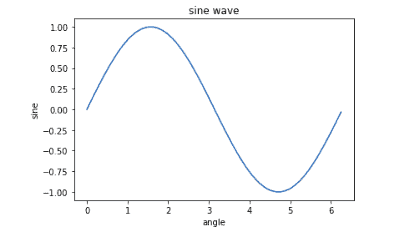
Let’s start our Matplotlib visualization journey with very basic trigonometry. We will plot the sine(x) and cosine(x) first:
%matplotlib notebook
# Importing the required module
import matplotlib.pyplot as plt
import numpy as np
import math
# ndarray object of angles between 0 and 2π using the arange()
x = np.arange(0, math.pi*2, 0.05)
# sin() values on y axis
y = np.sin(x)
# plotting
plt.plot(x,y)
# labeling
plt.xlabel("angle")
plt.ylabel("sine")
plt.title('sine wave')
# displaying plot
plt.show()
Output:
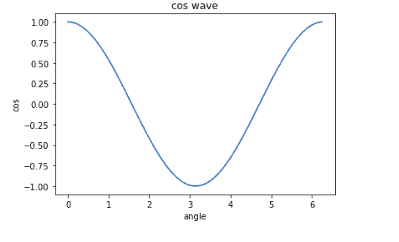
Similarly, we can plot the graph for the cosine wave as shown below:
%matplotlib notebook
# ndarray object of angles between 0 and 2π using the arange()
x = np.arange(0, math.pi*2, 0.05)
# cose values on y axis
y = np.cos(x)
# plotting
plt.plot(x,y)
# labeling
plt.xlabel("angle")
plt.ylabel("cos")
plt.title('cos wave')
# displaying plot
plt.show()
Output:
Multi plots
So far, we have learned how to create simple graphs in Matplotlib. Now, we can look at creating multiple subplots on the same canvas. It is easy to compare graphs together rather than in different cells. In this section, we will plot multigraphs using various methods.
subplots function
One simplest way to create multi-graphs in Matplotlib is to use the subplots() method.
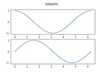
Let’s use this method to plot the sine and cosine wave graphs in the same cell:
%matplotlib notebook
# ndarray object of angles between 0 and 2π using the arange()
x = np.arange(0, 2*np.pi, 0.01)
# sin() and cos() values on y axis
y = np.cos(x)
y1 = np.sin(x)
# creating 2 subplots
fig, axs = plt.subplots(2)
# setting the title
fig.suptitle('Subplots')
# cos and sin waves
axs[0].plot(x, y)
axs[1].plot(x, y1)
Output:
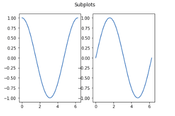
To plot the subplot in the horizontal direction, change the arguments in the subplots() method:
%matplotlib notebook
# creating 2 subplots
fig, (ax1, ax2) = plt.subplots(1, 2)
# setting the title
fig.suptitle('Subplots')
# cos and sin waves
ax1.plot(x, y)
ax2.plot(x, y1)
Output:
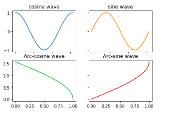
Using the above methods, we can plot more than two graphs along with their title and color of the graph:
%matplotlib notebook
# ndarray object of angles between 0 and 2π using the arange()
x = np.arange(0, 2*np.pi, 0.01)
# sin() and cos() values on y axis
y1 = np.cos(x)
y2 = np.sin(x)
y3 = np.arccos(x)
y4 = np.arcsin(x)

# creating subplots for 4 graphs
fig, axs = plt.subplots(2, 2)
# plotting the graphs, title and color
axs[0, 0].plot(x, y1)
axs[0, 0].set_title('cosine wave')
axs[0, 1].plot(x, y2, 'tab:orange')
axs[0, 1].set_title('sine wave')
axs[1, 0].plot(x, y3, 'tab:green')
axs[1, 0].set_title('Arc-cosine wave')
axs[1, 1].plot(x, y4, 'tab:red')
axs[1, 1].set_title('Arc-sine wave')
# we are hiding the x-labels so that the title will be visible
for ax in axs.flat:
    ax.label_outer()
Output:
add_subplot function
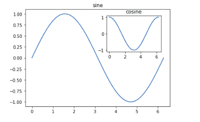
The add_subplot() function of the Figure class helps us to overwrite the existing graph without removing it. Using this method, we can lay off two plots on top of each other:
%matplotlib notebook
# defining the x
x = np.arange(0, math.pi*2, 0.01)
# initializing the figure
fig=plt.figure()
# adding axes
axes1 = fig.add_axes([0.1, 0.1, 0.8, 0.8])
axes2 = fig.add_axes([0.55, 0.55, 0.3, 0.3])
# ploting the cos and sin wave
axes1.plot(x, np.sin(x))
axes2.plot(x, np.cos(x))
axes1.set_title('sine')
axes2.set_title("cosine")
plt.show()
Output:
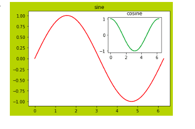
We can also specify the color of the graphs and the background, as shown below:
%matplotlib notebook
# initializing the figure
fig=plt.figure(facecolor='y')
# adding axes
axes1 = fig.add_axes([0.1, 0.1, 0.8, 0.8])
axes2 = fig.add_axes([0.55, 0.55, 0.3, 0.3])
# ploting the cos and sin wave
axes1.plot(x, np.sin(x), 'r')
axes2.plot(x, np.cos(x), 'g')
axes1.set_title('sine')
axes2.set_title("cosine")
plt.show()
Output:
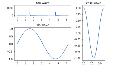
subplot2grid function
The subplot2grid() function gives more flexibility in creating an axes object at a specific grid location. It also helps in spanning the axes object across multiple rows or columns. In simple words, this function is used to create multiple charts within the same figure.
For example, let’s plot sine, cosine, and tan waves using this function:
%matplotlib notebook
# using subplot2grid function
sin_wave = plt.subplot2grid((3,3),(0,0),colspan = 2)
cos_wave = plt.subplot2grid((3,3),(0,2), rowspan = 3)
tan_wave = plt.subplot2grid((3,3),(1,0),rowspan = 2, colspan = 2)
# creating the x
x = np.arange(0, math.pi*2, 0.01)
# plotting the graphs
sin_wave.plot(x, np.tan(x))
sin_wave.set_title('tan wave')
cos_wave.plot(x, np.cos(x))
cos_wave.set_title('cose wave')
tan_wave.plot(x, np.sin(x))
tan_wave.set_title('sin wave')
# showing
plt.tight_layout()
plt.show()
Output:
Formatting plots
In this section, we will use different methods to format our plots. We will learn how to set up the grid, format axes, and set limits and labels.
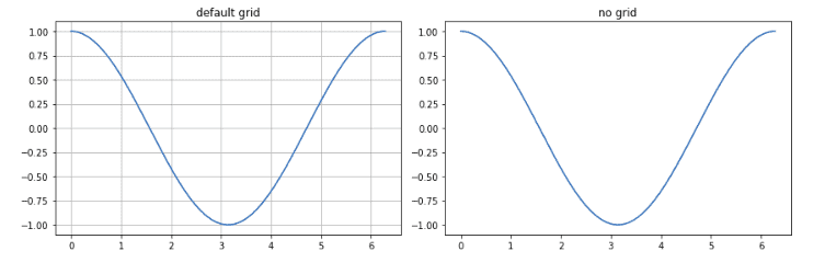
Grids
The grid() function of the Axes class sets the visibility of the grid for the figure. Moreover, you can also set color, line style, and line width properties.
Let’s visualize the cosine wave graph with grids:
%matplotlib notebook
fig, axes = plt.subplots(1,2, figsize = (12,4))
# creating the x
x = np.arange(0, math.pi*2, 0.01)
# graph with grid
axes[0].plot(x, np.cos(x))
axes[0].grid(True)
axes[0].set_title('default grid')
axes[1].plot(x,np.cos(x))
axes[1].set_title('no grid')
# plotting
fig.tight_layout()
plt.show()
Output:
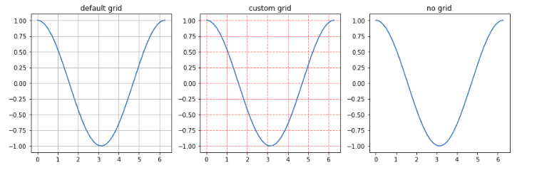
We can also customize the grids as shown below:
%matplotlib notebook
# creating three subplots
fig, axes = plt.subplots(1,3, figsize = (12,4))
# creating the x
x = np.arange(0, math.pi*2, 0.01)
# default grid
axes[0].plot(x, np.cos(x))
axes[0].grid(True)
axes[0].set_title('default grid')
# custom grid
axes[1].plot(x, np.cos(x))
axes[1].grid(color='r', ls = '-.', lw = 0.5)
axes[1].set_title('custom grid')
# no grid
axes[2].plot(x,np.cos(x))
axes[2].set_title('no grid')
fig.tight_layout()
plt.show()
Output:
Formatting axes
We can format the axes by labeling them or by changing the scaling. The scaling of the axes greatly impacts the shape of the graph, so it is important to scale the graph accordingly. For example, see below two graphs that represent the same function but on different scaling.
%matplotlib notebook
# initializaing the subplots
fig, axes = plt.subplots(1, 2, figsize=(10,4))
x = np.arange(0, math.pi*2, 0.01)
# normal scaling
axes[0].plot(x,np.cos(x), label='Cosine')
axes[0].set_title("Normal scale")
# scalling based on log
axes[1].plot(x, np.cos(x))
axes[1].set_yscale("log")
axes[1].set_title("Logarithmic scale y_axis")

# labeling
axes[0].set_xlabel("x axis")
axes[0].set_ylabel("y axis")
axes[1].set_xlabel("x axis")
axes[1].set_ylabel("y axis")
plt.show()
Output:
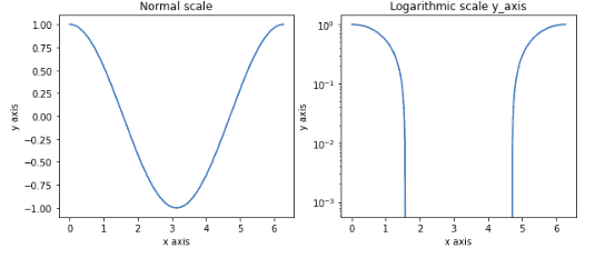
Both graphs represent the same information, but they look different because of the different y_axis scaling value.
Setting limits
So far, we have seen that Matplotlib automatically puts the minimum and maximum values of variables to be displayed along a plot’s “x” and “y” axes. We can also specify those limits using the set_xlim() and set_ylim(). For example, see the plotting below:
%matplotlib notebook
# creating two subplots
fig, axes = plt.subplots(1,2, figsize = (12,4))
# creating the x
x = np.arange(0, 5, 0.5)
# default scalling
axes[0].plot(x, np.exp(x))
axes[0].set_title('default scalling')
# setting limits
axes[1].plot(x, np.exp(x))
axes[1].set_title('setting limits')
axes[1].set_ylim(0,1000)
axes[1].set_xlim(0,10)
plt.show()
Output:
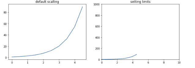
Although both graphs represent the same information, the scaling on both axes differs.
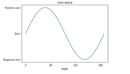
Setting labels
So far, we have seen that Matplotlib automatically takes over spacing points on the axis. However, we can locate and format the data points on both axes by passing a list object as an argument to the xticks() and yticks() functions.
Let’s plot the sine wave by labeling the x-axis data points and y-axis data points:
%matplotlib notebook
# creating x axis
x = np.arange(0, math.pi*2, 0.05)
fig = plt.figure()
# main axis
ax = fig.add_axes([0.1, 0.1, 0.8, 0.8])
y = np.sin(x)
ax.plot(x, y)
# labeling
ax.set_xlabel('angle')
ax.set_title('sine wave')
ax.set_xticks([0,2,4,6,])
ax.set_xticklabels(['0','60','120', '180'])
ax.set_yticks([-1,0,1])
ax.set_yticklabels(['Negative 0ne', 'Zero', 'Positive one'])
plt.show()
Output:
Bar plots
A bar plot is a plot that presents categorical data with rectangular bars with heights or lengths proportional to the values that they represent. The bars can be plotted vertically or horizontally. One chart axis shows the specific categories being compared, and the other axis represents a measured value.
The bar() method of the Matplotlib takes two required arguments:
- x: The x coordinates of the bar plot.
- y or height: The height or the value of each value.
It also takes several other optional arguments as well.
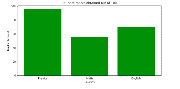
Simple bar plot
Let’s create a simple categorical dataset and visualize it by using a bar chart:
%matplotlib notebook
# creating dataset
data_dict = {'Physics':96, 'Math':56, 'English':70}
# course vs marks
courses = list(data_dict.keys())
marks = list(data_dict.values())
# plotting
fig = plt.figure(figsize = (10, 5))
#  Bar plot
plt.bar(courses, marks, color ='green',
        width = 0.8)
# labeling
plt.xlabel("Courses")
plt.ylabel("Marks obtained")
plt.title("Student marks obtained out of 100")
plt.show()
Output:
Unstacked bar plots
We usually use unstacked bar graphs to compare a certain category, especially over time, with different samples. It can be used to deduct some facts from the pattern we observe through the comparison. For example, when comparing several quantities and when one variable changes, we might want a bar chart with bars of one color for each quantity value.
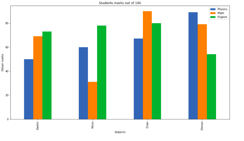
Let’s create a dataset for four students having different marks in three different subjects, and we compare their marks using unstack bar chart.
%matplotlib notebook
# importing the required module
import pandas as pd
# creating dataset
data = pd.DataFrame({
    "Physics":[50,60,67,89],
    "Math":[69,31,90,79],
    "English":[73,78,80,54]},
    index=["Bashir", "Mirzo", "Erlan", "Eliman"])
# ploting the bar chart
data.plot(kind="bar",figsize=(15, 8))
# labeling
plt.title("Students marks out of 100")
plt.xlabel("Subjects")
plt.ylabel("Obtain marks")
plt.show()
Output:
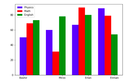
Another method to create a similar unstacked bar plot is the bar() method. We can plot multiple bar charts by playing with the thickness and the positions of the bars. Our data contains three subjects and contain the marks of four students. We will create bars having a thickness of 0.25 units. Each bar chart will be shifted 0.25 units from the previous one, as shown below:
%matplotlib notebook
# initializing the plot
fig = plt.figure()
X = np.arange(4)
ax = fig.add_axes([0,0,1,1])
# Plotting the graph for each of the subject
ax.bar(X + 0.00, data['Physics'], color = 'b', width = 0.25)
ax.bar(X + 0.25, data["Math"], color = 'r', width = 0.25)
ax.bar(X + 0.50, data["English"], color = 'g', width = 0.25)
# adding legends
ax.legend(labels=data[0:0])
# setting the x-asix
ax.set_xticks([0,1.5,2.5,3.5,])
ax.set_xticklabels(['Bashir','Mirzo','Erlan', 'Eliman'])
Output:
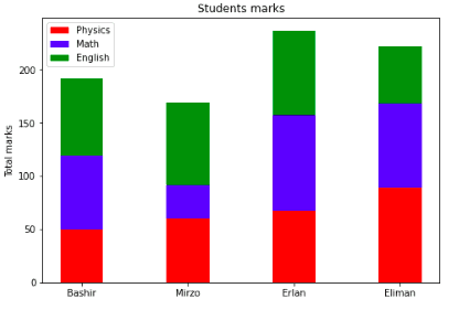
Stacked bar plots
The stacked bar plots are the plots that represent different groups on top of each other. The height of the resulting bar shows the combined result of the groups. We will now plot the bar chart of each subject appended to one another for each student.
%matplotlib notebook
# initialiazing the plot
fig = plt.figure()
ax = fig.add_axes([0,0,1,1])
# ploting stacked bar plots
ax.bar(X, data['Physics'], width = 0.4, color='r')
ax.bar(X, data['Math'], width=0.4,bottom=data['Physics'], color='b')
ax.bar(X, data['English'], width=0.4,bottom=data['Math']+data['Physics'], color='g')
# labeling
ax.set_ylabel('Total marks')
ax.set_title('Students marks')
ax.legend(labels=['Physics', 'Math', 'English'])
# setting the x-asix
ax.set_xticks([0,1,2,3,])
ax.set_xticklabels(['Bashir','Mirzo','Erlan', 'Eliman'])
plt.show()
Output:
Pie plots
A Pie plot is a type of graph in which a circle is divided into sectors representing a proportion of the whole. Matplotlib has a pie() function that generates a pie diagram representing data in an array. It can take the following arguments:
- x: The array.
- labels: a sequence of strings providing the labels.
- colors: A sequence of matplotlib color arguments through which the pie chart will cycle.
- autopct: A string that labels the wedges with their numeric value.
- shadow: It is used to create the shadow.
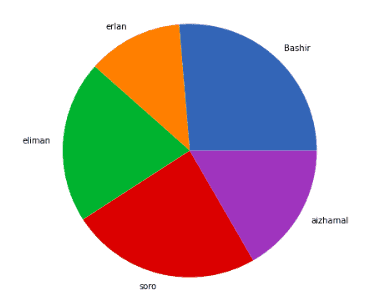
Simple pie plot
Let’s now create a very simple dataset and plot that dataset using a pie chart:
%matplotlib notebook
# Creating dataset
cars = ['AUDI', 'BMW', 'FORD',
        'TESLA', 'JAGUAR', 'MERCEDES']

data = [23, 17, 35, 29, 12, 41]

# Creating plot
fig = plt.figure(figsize =(10, 7))
plt.pie(data, labels = cars)

# show plot
plt.show()
Output:
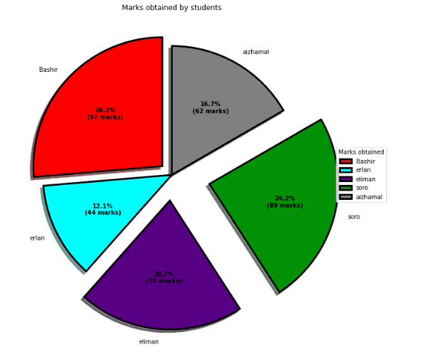
Customizing pie chart
A pie chart can be customized based on several aspects. The startangle attribute rotates the plot by the specified degrees in a counterclockwise direction performed on the x-axis of the pie chart. The shadow attribute accepts a boolean value. If it is true, then the shadow will appear below the rim of the pie.
Let’s apply different customization and plot pie charts:
%matplotlib notebook
# Creating explode data
explode = (0.1, 0.0, 0.2, 0.3, 0.0)

# Creating color parameters
colors = ( "red", "cyan", "indigo","green", "gray")

# Wedge properties
wp = { 'linewidth' : 3, 'edgecolor' : "black" }

# Creating autocpt arguments
def func(pct, allvalues):
    abslt = int(pct / 100.*np.sum(allvalues))
    return "{:.1f}%\n({:d} marks)".format(pct, abslt)

# Creating plot
fig, ax = plt.subplots(figsize =(15, 10))
wedges, texts, autotexts = ax.pie(marks,
                                  autopct = lambda pct: func(pct, marks),
                                  explode = explode,
                                  labels = names,
                                  shadow = True,
                                  colors = colors,
                                  startangle = 90,
                                  wedgeprops = wp,
                                  textprops = dict(color ="black"))

# Adding legend
ax.legend(wedges, names,
          title ="Marks obtained",
          loc ="center left",
          bbox_to_anchor =(1, 0, 0.5, 1))
plt.setp(autotexts, size = 10, weight ="bold")
ax.set_title("Marks obtained by students")

# show plot
plt.show()
Output:
Scattered plots
Scatter plots are a good way of displaying two sets of data or if there is a correlation or connection in the dataset. It is a graph with the independent variable on the horizontal axis and the dependent variable on the vertical axis. Each data pair has a dot or a symbol where the x-axis value intersects the y-axis value.
The scatter() method plots scattered plots, which take data on the x-axis, data on the y-axis, and several other optional arguments.
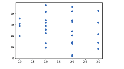
Simple scattered plot
A simple scattered plot takes two arguments. Frist data is for the x-axis, and the second data is for the y-axis.
For example, let’s create a simple dataset and then will visualize it by using a scattered plot:
%matplotlib notebook
# creating random dataset
x_axis = np.array(np.random.randint(4, size=(30)))
y_axis = np.array(np.random.randint(100, size=(30)))
# plotting simple scattered plot
plt.scatter(x_axis, y_axis)
plt.show()
Output:
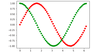
Merging scattered plots
Merged scattered plots can be very useful for comparing several datasets.
For example, let’s plot the sine wave and cosine wave using a scatter plot:
%matplotlib notebook
# creating independent variable
x = np.arange(0, math.pi*2, 0.1)
# ploting sine wave
plt.scatter(x, np.sin(x), color='r')
# plotting cosine wave
plt.scatter(x, np.cos(x), color='g')
plt.show()
Output:
Size and transparency of dots
We can also specify the sizes and transparency to make it more informative. For example, we will plot the sine wave and cosine wave by specifying the sizes of each point to be random (form 10000) and then plot then using a scatter plot with a transparency of 0.5.
%matplotlib notebook
# creating independent variable
x = np.arange(0, math.pi*2, 0.8)
# creating sizes of random sizes
S=[]
for i in range(len(x)):
    S.append(np.random.randint(10000))

# ploting sine wave
plt.scatter(x, np.sin(x), color='r', s=S, alpha=0.5)
# plotting cosine wave
plt.scatter(x, np.cos(x), color='g' , s=S, alpha=0.5)
plt.show()
Output:
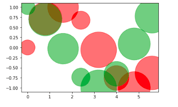
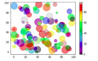
Color with size and transparency
We can also combine a colormap with different sizes on the dots. This is best visualized if the dots are transparent.
Let’s create a random dataset and will visualize it with different colors and dot sizes. We can also specify the colormap with the keyword argument cmap with the value of the colormap, in this case, 'viridis' which is one of the built-in colormaps available in Matplotlib. In addition, we will create an array with values (from 0 to 100), one value for each of the points in the scatter plot:
%matplotlib notebook
# creating  random dataset
x_axis = np.random.randint(100, size=(100))
y_axis = np.random.randint(100, size=(100))
colors = np.random.randint(100, size=(100))
sizes = 10 * np.random.randint(100, size=(100))
# ploting the graph
plt.scatter(x_axis, y_axis, c=colors, s=sizes, alpha=0.5, cmap='nipy_spectral')
# plotting the color bar as well
plt.colorbar()
plt.show()
Output:
Box plot
A box plot is a simple way of representing statistical data on a plot in which a rectangle is drawn to represent the second and third quartiles, usually with a vertical line inside to indicate the median value. The lower and upper quartiles are shown as horizontal lines on either side of the rectangle.
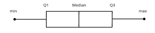
The boxplot() method in the Matplotlib module plots the boxplots, which can take the following parameters.
data: array to be plotted.vert: It is an optional parameter that accepts the boolean values for vertical and horizontal plotting.bootstrap: It is also an optional parameter that specifies intervals around notched boxplots.positions: It is an optional parameter that accepts an array and sets the position of boxes.widths: It is an optional parameter that accepts an array and sets the width of boxes.labels: It is a sequence of strings that sets labels for each dataset.order: It sets the order of the boxplot.
Simple box plot
Let’s plot a very simple box plot using the Matplotlib module.
First, we need a random dataset which we will visualize afterward:
%matplotlib notebook
# Creating dataset
data = np.random.normal(1000, 20, 200)

# ploting size
fig = plt.figure(figsize =(10, 7))

# Creating plot
plt.boxplot(data)
plt.show()
Output
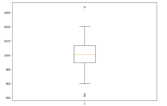
The dot points outside the box plot show the outliers in our dataset.
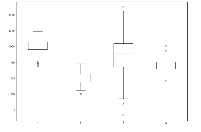
Multi-box plotting
We can also plot multi-box plots by specifying the axes. For example, let’s create four random datasets and then plot box plots for each of them:
%matplotlib notebook
# creating random dataset
data1 = np.random.normal(1000, 100, 200)
data2 = np.random.normal(500, 90, 200)
data3 = np.random.normal(880, 300, 200)
data4 = np.random.normal(700, 90, 200)
data = [data1, data2, data3, data4]
# plot size
fig = plt.figure(figsize =(10, 7))

# Creating axes instance
ax = fig.add_axes([0, 0, 1, 1])

# Creating plot
bp = ax.boxplot(data)
plt.show()
Output:
Violin plots
A violin plot is a hybrid of a box plot and a kernel density plot, which shows peaks in the data. It is used to visualize the distribution of numerical data. Unlike a box plot that can only show summary statistics, violin plots depict summary statistics and the density of each variable.
The violinplot() in matplotlib can take the following parameter:
data: This parameter denotes the array or sequence of vectors.positions: This parameter is used to set the positions of the violins.vert: This parameter contains the boolean value. If the value of this parameter is set to true, it will create a vertical plot; otherwise, it will create a horizontal plot.showmeans: This parameter contains the boolean values. If this parameter’s value is True, it will toggle the means rendering.showextrema: This parameter contains the boolean values. If this parameter’s value is True, it will toggle the rendering of the extrema.showmedian: This parameter contains the boolean values. If this parameter’s value is True, it will toggle the rendering of the medians.
Simple violin plot
We will now visualize the violin plot on a random dataset using the Matplotlib module.
Let’s first create a random dataset and then will visualize using a violin plot:
%matplotlib notebook
# creating a random dataset
data = np.random.randint(1000, size=(100))
# plotting simple violin plot
plt.violinplot(data, showmeans=True, showextrema=True, showmedians=True)
plt.show()
Output:
Multi-violin plots
Now let’s create some normal distributions and visualize them using violin plots:
%matplotlib notebook
# creating a random dataset
data1 = np.random.normal(1000, size=(100))
data2 = np.random.normal(1000, size=(100))
data3 = np.random.normal(1000, size=(100))
data4 = np.random.normal(1000, size=(100))
data = [data1, data2, data3, data4]
# plotting simple violin plot
plt.violinplot(data, showmeans=True, showextrema=True, showmedians=True)
plt.show()
Output:
Stem plot
A Stem plot plots vertical lines at each x position covered under the graph from the baseline to y and places a marker there. This section will plot the stem plot of sine and cosine waves.
%matplotlib notebook
# creating the data
x = np.arange(0, math.pi*2, 0.1)
# plotting for cosine wave
plt.stem(x, np.cos(x))
plt.show()
Output:
Moreover, we can also customize the plot to make it more beautiful and informative.
%matplotlib notebook
# customizing the stem plot
plt.stem(x, np.sin(x), linefmt='green', markerfmt='*', bottom=0, label="Sine")
plt.stem(x, np.cos(x), linefmt='red', markerfmt='-', bottom=0, label="Cosine")
plt.show()
Output:
Quiver plots
A quiver plot is a type of 2D plot which shows vector lines as arrows. This type of plot is useful for Electrical engineers to visualize electrical potential and show stress gradients in Mechanical engineering.
The quiver() method in the Maplotlib is used to plot the quiver plot, which can take the following parameters:
x_cordinate: x-coordinate of the arrow location.y_cordinate: y-coordinate of the arrow location.x_direction: x-component of the direction of the arrow.y_direction: y-component of the direction of the arrow.scale: Used to scale the plotting.angle: used to determine the angle of the arrow vectors plotted.
Quiver plot with one and two arrows
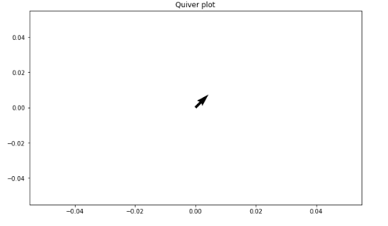
Let’s plot the quiver plot with one and two arrows. First, let’s plot one arrow quiver plot with the x and y coordinate at zero and with the x, and y-direction:
%matplotlib notebook
# Creating arrow
x_position = 0
y_position = 0
x_direction = 1
y_direction = 1

# Creating plot
fig, ax = plt.subplots(figsize = (10, 6))
ax.quiver(x_position, y_position, x_direction, y_direction)
ax.set_title('Quiver plot')
plt.show()
Output:
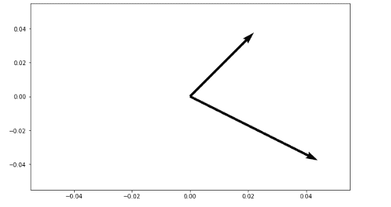
Now, let’s plot a similar plot with two arrows centered at 0, 0:
%matplotlib notebook
#setting position and direction
x_position = [0, 0]
y_position = [0, 0]
x_direction = [1, 2]
y_direction = [1, -1]

# Creating plot
fig, ax = plt.subplots(figsize = (10, 6))
ax.quiver(x_position, y_position, x_direction, y_direction, scale=5)
plt.show()
Output:
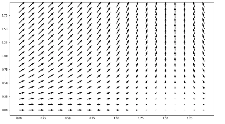
Quiver plot using meshgrid method
A quiver plot containing two arrows is a good start, but it is too long to add arrows to the quiver plot one by one. So to create a fully 2D surface of arrows we will use the meshgrid() method of Numpy. A meshgrid() function is used to create a rectangular grid out of two given one-dimensional arrays representing Cartesian indexing or Matrix indexing.
Let’s use the meshgrid() function and plot a quiver plot:
# Creating arrows
x = np.arange(0, 2, 0.1)
y = np.arange(0, 2, 0.1)

# meshgrid method
X_coordinate, Y_coordinate = np.meshgrid(x, y)
# setting direction
x_direction = np.cos(X)
y_direction = np.sin(Y)

# creating plot
fig, ax = plt.subplots(figsize =(14, 8))
ax.quiver(X_coordinate, Y_coordinate, x_direction, y_direction)
plt.show()
Output:
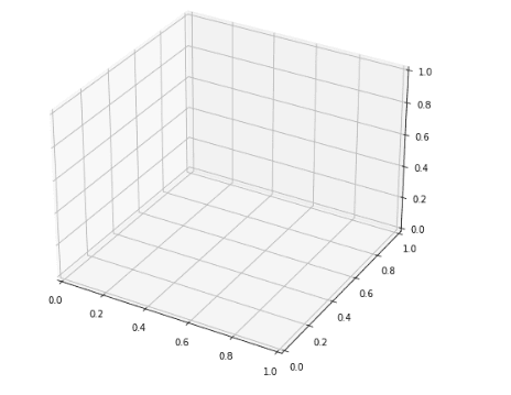
Three-dimensional plotting
3D scatter plots show data points on three axes to show the relationship between three variables. Each row in the data table is represented by a marker whose position depends on its values in the columns set on the X, Y, and Z axes. In this section, we will plot various kinds of plots that we have covered in 3-dimensional space.
Apart from the Matplotlib module, we can also import the mplot3d module from mpl_toolkits which is required for enabling 3D projections.
Let’s create a 3D space for plotting:
%matplotlib notebook
# importing the required module
import matplotlib.pyplot as plt
from mpl_toolkits.mplot3d import Axes3D
# size of the figure
fig = plt.figure(figsize=(8,8))

# 3-d plot
ax = fig.add_subplot(projection='3d')
Output:
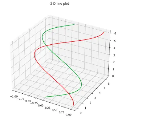
3D line plot
Now, we can plot a line graph in 3D space. Let’s create sine and cos waves to visualize it in 3D space:
%matplotlib notebook
# initializing the 3-d space
# initializing the 3-d space
fig = plt.figure(figsize=(8,8))
ax = plt.axes(projection='3d')
# creating the variables
z = np.arange(0, math.pi*2, 0.1)
x =  np.sin(z)
y= np.cos(z)
# plotting
ax.plot3D(x, z, z, 'green')
ax.plot3D(y, z, z, 'red')
ax.set_title('3-D line plot')
plt.show()
Output:
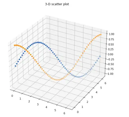
3D scattered plot
Plotting a three-dimensional scattered plot is very similar to the line plot. Let us visualize the same functions using a scattered plot in three-dimensional space.
%matplotlib notebook
# initializing the 3-d space
fig = plt.figure(figsize=(8,8))
ax = plt.axes(projection='3d')
# plotting
ax.scatter(z, z, x, 'green')
ax.scatter(z, z, y, 'red')
ax.set_title('3-D scatter plot')
plt.show()
Output:
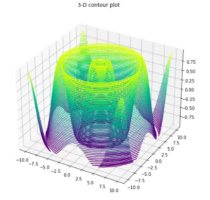
3D contour plot
One of the best ways to visualize any mathematical function is using contour plots. For example, let’s visualize the sinusoidal on the three-dimensional graph using a counterplot:
%matplotlib notebook
# function to return sinusoidal function
def f(x, y):
   return np.sin(np.sqrt(x ** 2 + y ** 2))
# creating x and y
x = np.linspace(-10, 10, 50)
y = np.linspace(-10, 10, 50)
# using meshgrid function for x and y
X, Y = np.meshgrid(x, y)
Z = f(X, Y)
# plotting the graph
fig = plt.figure(figsize=(8, 8))
ax = plt.axes(projection='3d')
ax.contour3D(X, Y, Z, 50)
ax.set_title('3-D contour plot')
plt.show()
Output:
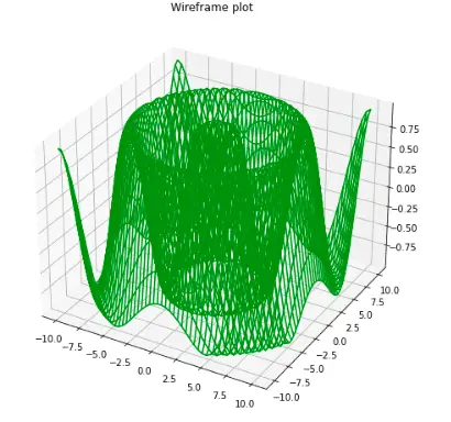
3D wireframe plot
Wireframe plot is another way to plot in three-dimensional space that takes a grid of values and projects it onto the specified three-dimensional surface and can make the resulting three-dimensional forms quite easy to visualize.
We will again use the same function and visualize it using this wireframe plot:
%matplotlib notebook
fig = plt.figure(figsize=(8,8))
ax = plt.axes(projection='3d')
#wirefram plot
ax.plot_wireframe(X, Y, Z, color='green')
ax.set_title('Wireframe plot')
plt.show()
Output:
3D surface plot
Surface plots are diagrams of three-dimensional data. Rather than showing the individual data points, surface plots show a functional relationship between a designated dependent variable (Y) and two independent variables (X and Z).
Let’s visualize the sinusoidal function using the surface plot:
%matplotlib notebook
# size of the 3-d plot
fig = plt.figure( figsize=(8, 8))
ax = plt.axes(projection='3d')
# surface plot
ax.plot_surface(X, Y, Z, color='green')
ax.set_title('Surface plot')
plt.show()
Output:
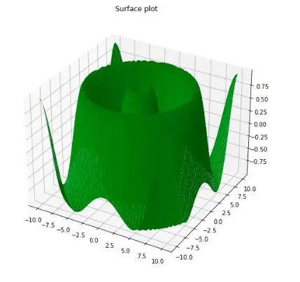
Image functions in Matplotlib
Apart from plotting various graphs, the Maplotlib library can also read, save and view images. The two most important methods are the imread() and imshow() functions. In this section, we will be using a sample image to illustrate read, save, and show operations:
Read image
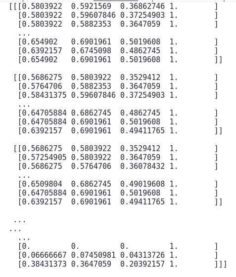
The imread() method in matplotlib.image module is used to read images. Let’s read an image using the imread() method:
%matplotlib notebook
# importing the required module
import matplotlib.image as img

# reading the image using imread()
sample_image = img.imread('Image.png')

# displaying the image as an array
print(sample_image)
Output:
Displaying image
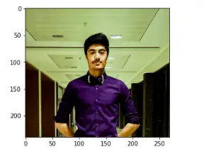
The imshow() method in Maplotlib is used to display an image. Let’s use this method to display the image that we’ve read:
%matplotlib notebook
# reading the image using imread()
sample_image = img.imread('Image.png')

# displaying the image
plt.imshow(sample_image)
Output:
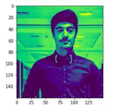
Modifying image
As we know that an image consists of an array of numeric numbers, so any change to these numbers will modify the image.
Let’s play with these numbers and modify our original image:
# modifying the shape of the image
modifiedImage =  sample_image[40:200, 50:200, 1]

# shape difference
print(modifiedImage.shape)
print(sample_image.shape)
Output:

The shape of the modified image is not the same as the original image.
Let’s display the modified image:
%matplotlib notebook
# display the image
plt.imshow(modifiedImage)
Output:
Tips & Tricks
Creating Animations
Matplotlib can be used to create animations of plots. To do this, you can use the animation module. The following code shows how to create an animation of a bouncing ball:
%matplotlib notebook
import matplotlib.pyplot as plt
import matplotlib.animation as animation
import matplotlib.patches as patches
# Set the limits
xlim = (-100, 100)
ylim = (-100, 100)
# Initialize position and velocity
x, y = 0, 0
dx, dy = 2, 3  # velocity
# Create the figure and axes
fig, ax = plt.subplots()
# Set the limits
ax.set_xlim(xlim)
ax.set_ylim(ylim)
# Create the ball
radius = 10
ball = patches.Circle((x, y), radius)
ax.add_patch(ball)
# Define the update function
def update(frame):
    global x, y, dx, dy
    x += dx
    y += dy
    # If ball hits the wall, change direction
    if not xlim[0] + radius <= x <= xlim[1] - radius:
        dx *= -1
    if not ylim[0] + radius <= y <= ylim[1] - radius:
        dy *= -1
    ball.center = (x, y)
    return ball,
# Create the animation
ani = animation.FuncAnimation(fig, update, frames=range(100), blit=True, interval=100)
plt.show()
Saving Plots to Files
Matplotlib can save plots to various file formats, including PNG, JPG, and PDF. To do this, you can use the savefig method. The following code shows how to save a plot to a PNG file:
import matplotlib.pyplot as plt
# Create the plot
plt.plot([1, 2, 3], [4, 5, 6])
# Save the plot to a PNG file
plt.savefig('my_plot.png')
Interacting with Plots in Real Time
Matplotlib can be used to create interactive plots that the user can manipulate. To do this, you can use the interactive kwarg when creating the figure. The following code shows how to create an interactive plot of a sine wave:
%matplotlib notebook
import matplotlib.pyplot as plt
import numpy as np
# Create the figure and axes
fig, ax = plt.subplots()
# Plot the sine wave
x = np.linspace(0, 2 * np.pi, 100)
line, = ax.plot(x, np.sin(x))
# Update the plot when the user interacts with it
def update(event):
    if event.xdata is not None:
        line.set_ydata(np.sin(x + event.xdata))
        fig.canvas.draw_idle()
# Connect the update function to mouse motion event
fig.canvas.mpl_connect('motion_notify_event', update)
# Show the plot
plt.show()
Move the mouse over the plot to see how it’s moving.
Summary
Matplotlib is a plotting library for the Python programming language. It is used to plot data by using various kinds of graphs. In this article, we covered how to use the Matplotlib module and visualize different datasets through various plots. Additionally, we’ve covered how to read and display images using the Matplotlib module.